

How we can use Stranger things as an example to create inspiring design.
- Kim Tiong

- Sep 23, 2019
- 4 min read
Hello everyone I wanted to create a post about something I noticed recently. Now Im a pretty big nerd for sci-fi so it was natural of me to stumble upon Netflix’s “Stranger Things”. As I was watching I found this concept of there writers choice for the story to be set in the early 80’s therefore I thought it would just be an modern attempt to dress up the kids in 80’s clothes but NO I was pleasantly surprised as the titles appeared and it left the audience with a cinematic nostalgia.

The Directors and graphics team really put a lot of effort in making his title not only is it simply red and black to emphasise something scary it approaching but for me personally it felt like I was watching an old video tape I had inserted into my VCR due to the graininess of the titles like the image was cracking. Automatically I became very invested in the visual execution of this series.
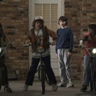
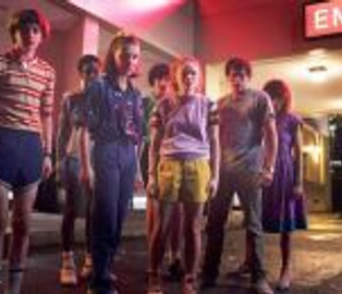
Throughout season one I was very sceptical as to when this series was set looking into the surrounding characters style and environment I could only assume the 70’s as for some reason they had this “citrus” colour pallet consisting of brown, orange , white , yellow , beige, red, white and black.


So since the interiors were like this and the camera which was used seemed grainy as well to mimic this era I had no choice but to think it must be set in the late 70’s. There was even a punk scene going on in another town which looked very 70’s which backed this theory up however the punk era also continued to thrive from the 70’s to early 80’s.


But this could of also been reflective of lost boys which came out in 1987 which I began to get this type of vibe off of.

As I was continuing to watch this series in the beginning I noticed chopper bikes particularly rally bikes now this may be hand downs as some of the boys bikes are defiantly not new since theres gaffer tape/electrical tape on some of the handle bars but these bikes were developed and sold during the 70’s so it could be second hand ones from the late 70s that the kids were given towards the early 80s but again the level of detail I found was so interesting.


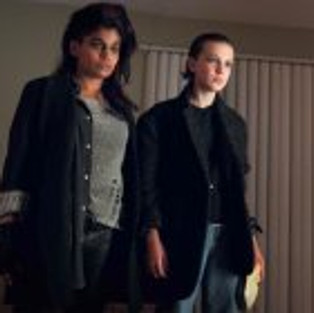
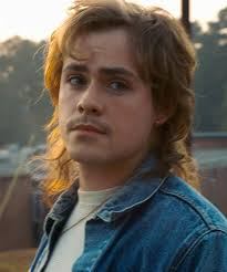
Not to mention the Marty Mcfly jacket that Will wears^^^

Speaking of Marty Mcfly film posters back in the day seemed like they were illustrated as it has this vintage look of what appears to be a painting which is recreated in every single stranger things poster campaign but each poster you can visually tell the different the eras in each season which I find gives the viewers a good atmosphere and mindset to base the show from.


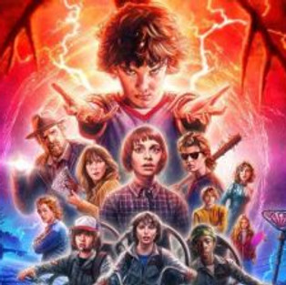


The graphics team did a good job of this type of nostalgic poster which could also be inspired from the infamous star wars poster New Hope.

So not only have I noticed the change of style progressing each year through interiors and fashion hair seems to change and progress into the 80’s we know and love. With through backs to mullets, bowl cuts and perms; these overgrown cuts seemed to be a fashion statement and even more so towards todays hair style with messy bed hair and loose curls and waves… maybe not as extreme as the big hair but we do see the occasional back comb look on cheeky night outs!


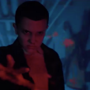
As the show progressed the style progressed not only in fashion but also vibe and cinematography and lighting. From the ironic colours of red, brown/beige, black white and yellow that was seen during the beginning of the film as the character and years progress so does the style, lighting and tone.
For some reason a lot of pink is used in the lighting and even in clothes that the characters wear; it is very reminiscent to save by the bell a very iconic “cult show”.not to mention a lot of strange geometric shapes in the background. Not sure what thats about but it was pretty rad a the time. But I find the 80’s style coming back now with the hipster pattern shirts and bright coloured scrunches.


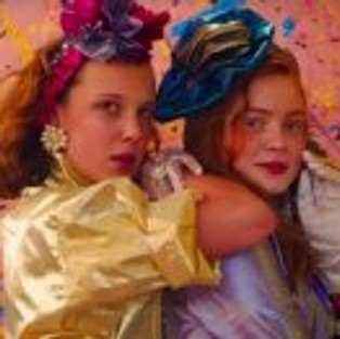
Lastly what makes the series of stranger things isn’t just the scary monsters and the storyline for me what ties it together is the cinamatography and lighting is a very powerful thing. This is something that inspires me in my own photography as those intense colours that reflect on the characters creates a very retro vibe and defiantly creates an intense emotional atmosphere. Again neon is a very stereo typical 80’s glam rock image similarly creating a some what Las Vegas vibe. Truly stunning.


Overall the cinematography is so inspiring to use even using such things like gel lighting or having coloured agitate would give this effect to the simplest of photographs but I feel we need this nostalgia even thug it is at times overlooked. I understand that perhaps an over use of pink was used but since this tv show was based loosely around the Cold War and Soviet Union and using pink to either calm or scare the Russians I feel this pink was used purposely. It seemed like a fun, creative free era were people could wear funky patterns, big hair and be utterly saturated in neon but why can’t we be nostalgic. We are constant on our phones a lot and back then there was the brick phone (how far we have come). Over the weekend I went to the Linda McCartney photography exhibit and was sp amazed by her manual and Polaroid work and how low tech can become the highest of quality and capturing this vintage style and memory. If we can capture this “vintage” memories to create an atmosphere using design and not just for the purpose of “fad” having more definition and meaning then perhaps this could be a way to bring everyone into normal conversation even if it is a little outrageous.
In the immediate future I do intend to use this style in my practise as I begin to slowly introduced this concept of coloured lighting in my photography. During my time doing my masters course I did a project experimenting with coloured light in arcades. To view this click bellow:
Defiantly an inspiring time so save this space for more content on the 80’s style.


Comments